Monday, July 25, 2011

Lighting Issues 02

The last post examined some of the different kinds of light and light sources use in cinematography and design rendering. The former uses many specific lights (key, fill, kicker, bounce, ambient, spot, direct, etc.) while the latter may incorporate only a few of these in a drawing. For many designers, understanding how light illuminates form, surfaces and details represents a lifelong education. Unless you are creating a design that looks exactly like a geometric object (cube, cone, cylinder or sphere, solids traditionally studied in school from a light perspective), you may not have a good precedent for how light interacts with the surface, creating shade, cast shadows and highlights. Even the best visualizers must use some sort of existing example to predict, on paper, what a solid object will look like with light shone on it.

A good method to initiate this process is to find or supply a single light source (sunlight or a flashlight) and place representative solids in position to exhibit the same conditions represented in the drawing (Fig.01.)

Fig01 - A simple object in natural sunlight to understand shading/cast shadows.

An alternative, more easily done now than before, is to model the shape in a computer program (Maya) and configure relative light conditions.

In Industrial Design a concept sketch uses a cast shadow to help define the form of the product by integrating a dark background that, in contrasting with the lighter tones of the focal point, helps to generate the impression of three-dimensionality and reality that a line drawing or simple shading cannot (Fig.02.)

Fig. 02 - Outdoor grill concept sketch

Additionally, there are added benefits to establishing a light system for the concept drawings. Incorporating a hierarchy of light and colored light sources helps to define visual depth. Syd Mead, a long-time designer, 'futurist' (as he refers to himself), and visualizer is a master of integrating warm and cool light sources to create a sense of great depth beyond the picture plane (Fig.03.)


Fig.03_ Syd Mead

There are three components: first, a key light used for primary imaging, often associated with parallel light rays ('infinite' light in cinematographic terms); second, ambient or reflected lighting that adds depth and complexity to the reflected light in the shadows - often a warm ground tone; third, reflected light from the distant horizon or sky - often a cool, bluish tone - seen on the rear trailing surfaces of the product. This latter may be termed a kicker or bounce light. Even though the concept sketch may be of an interior product, using warm and cool contrasting tones helps with the shadow to create the 3D characteristic. See Figure 01 for directions the lights may originate from.

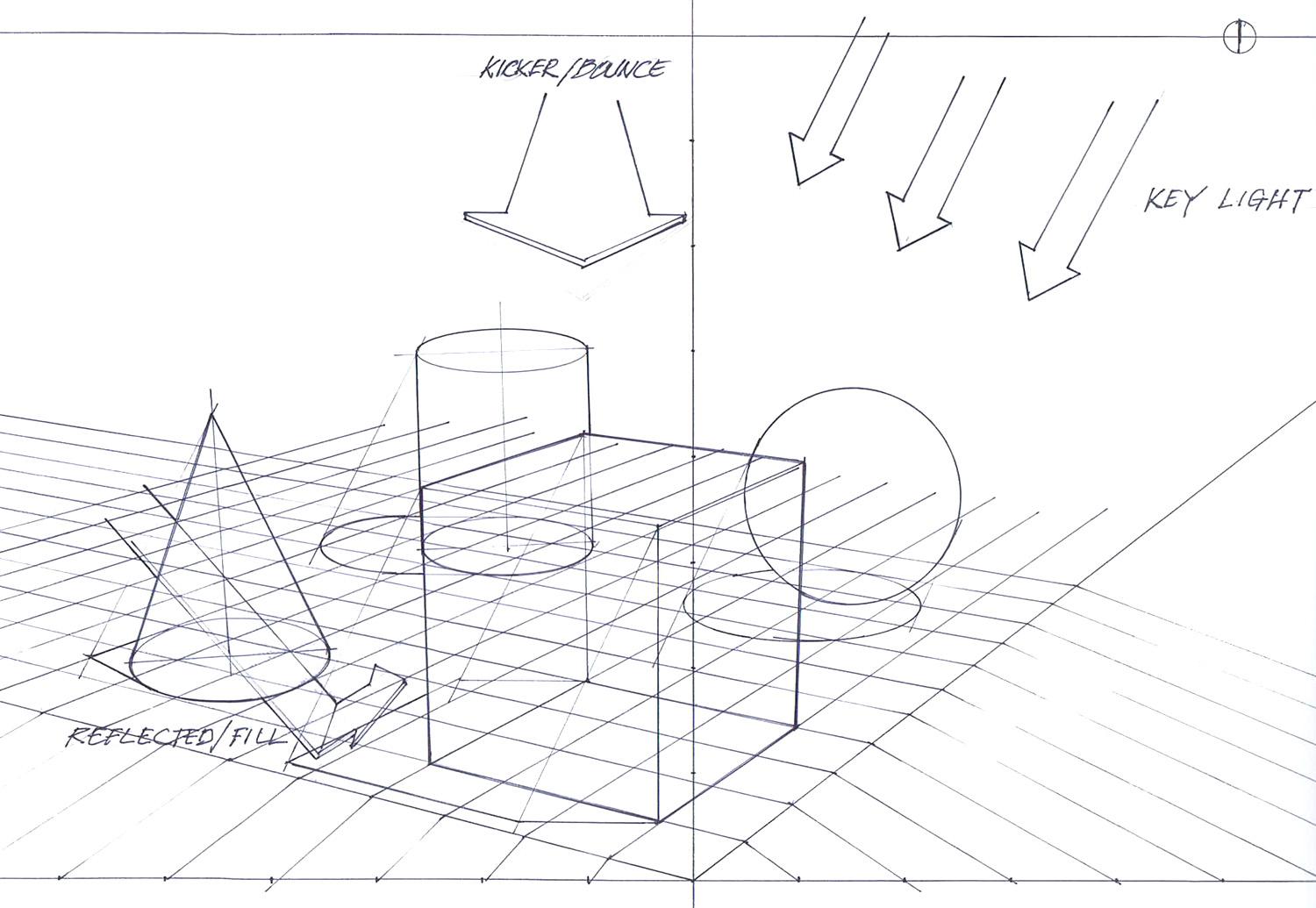
Figure01 - General ID product sketch lighting scenarios


A good example of this kind of image is shown in Figure 02 of a gouache rendering of a John Deere tractor in 1940 for Henry Dreyfuss Associates. A strong cast shadow with warm fill tones in front and underneath and cooler sky tones reflected on top and trailing surfaces offer a near-photographic if muted quality of visualization.


Fig.02 - Flinchum, R. (1997), Henry Dreyfuss, Industrial Designer - The Man In The Brown Suit. New York, NY: Rizzoli International Publications. p.120


Unfortunately, there is no formula for calculating or adjusting the intensity, color and configuration of each of the light sources indicated here. The rendering's effectiveness is generally a result of direct observation from life and techniques of other designers as well as some level of instruction. As can often be the case, each designer will choose a preferred method of visualization and adapt it to his/her process.

In Maya and computer rendering, however, the ability to control, adjust, manipulate, and configure these variables is so powerful, any one task may not ever approach the software's capacity. Accordingly, one must learn each well enough to understand the repercussions of settings intended or not as exhibited in my first crude examples.

The mental models used to light a product are also different between drawing and computer rendering. Fill lighting, for example, cannot be assumed to reflect off a ground plane and upward into the underside of an object; it may be projected from a viewpoint within inches of the object even if the final effect resembles a lightsource far away in real life. Figure 03 shows the positions of the key, fill, and bounce lights. The light positions, accordingly, must be adjusted if the perspective view is changed to make sure the viewed surfaces are reflecting light and are properly illuminated for the observer.

Fig.03 - Maya image of solids with key, bounce and fill light positions and effects


As indicated in the previous post, composition of the physical elements should be considered not just for maximum views of surfaces and details but also to use highlights and cast shadows of one solid or area as backgrounds to another subject to help create a visual perception of depth. Cinematographers use spot and
rim lights to isolate and frame subjects in the process of creating a visual hierarchy so the viewer is never confused about what he/she should focus their attention on.

The next post will begin to examine the process of casting shadows in drawing and in 3D rendering.


Monday, July 18, 2011

Rendering - Lighting Issues01

Lighting a scene is often one of those elements of a visual production that goes unnoticed or is taken for granted - until it's done poorly.

Whether the presentation is theatre, TV, film, computer animation, drawing, painting, or design visualization, adding visual depth using light and shadow produces a powerful effect. Not only may the image literally represent another reality but the image maker can orchestrate the scene to specifically direct our attention. The observer has an easier time understanding an image created with the use of light than one rendered flat or purely graphic in nature. Many people in the design or entertainment industry are visually literate enough to see important value in the 'napkin sketch' that offers ideas drawn without shading, color or value. Designers, however, need to show an understanding of how light works to cater to the largest possible audience for their ideas.

The science of lighting is an integral part of the design of a visual in cinematography but curiously absent from the curriculum of industrial design.

Design concepts may be rendered with one light source but most effectively use three: key, fill, and kicker or rim lights. In Figures 01, 02, 03, and 04 from Pixel Cinematography - A Lighting Approach for Computer Graphics by John Kahrs, the author first shows the overall effect of 'standard' studio lighting and then visually separates each.


Fig.01 - Kahrs, J. (1996), p.45 - Studio lighting with key, fill, and kicker lights
   

Fig.02 - Kahrs, J. (1996), p.47 - Key light


Fig.03 - Kahrs, J. (1996), p.48 - Fill light


Fig.04 - Kahrs, J. (1996), p.49 - Kicker or Rim light


In industrial design, a product is generally illuminated from the side with a primary light source, sometimes referred to as an "infinite" light source, similar to the sun: the rays are parallel when casting shadows. The position angle of the light source should be carefully chosen. Too high and there's not enough cast shadow; too low and the cast shadow (dark, contrast) dominates the scene. To show a maximum level of detail and form, scene lighting works best if there is good contrast between the object and the background. To generate many concepts quickly, it often works best to have the background and ground plane as white and the product dark or with color so that the viewer's eye is drawn immediately to the main image. In Figure 05, the contrast of the object makes it the main focal point with a light background. The cast shadow establishes the ground plane. Fill light is seen in the lighter areas of sides 2, 3 representing reflected light from the key light striking the ground. Secondary lighting, shown as the reflected lighter area on the back top surface of the cube, represents the "kicker" lighting.
  
 
Fig.05 - Industrial design concept visualization with light


Often in different types of imagery,
the artist will add color to the lights/
light sources. Comic illustrators may
use a combination of warm and cool
colors in lighting from two sides
(primary/secondary or key/kicker).
Using colors in this way will increase
the visual effect of depth and realism
to the image (see Figure 06.)


Fig.06 - Kerlow, I. (2004), p.202


Last week I began to explore some of these lighting issues in Maya with the geometric objects set on a plane.
With only marginal knowledge of the lighting systems available in the software, I set a primary light as shown previously and then an Ambient light thinking it might work as a fill/kicker light source. Working with the two variables of light Intensity and Ambient Shade I was able to insert secondary fill/reflected lighting with different colors, one cool and one war(Figure07,08.)


Fig.07 - Blue reflected ambient light


Fig.08 - Ochre/ground tone reflected ambient light


It wasn't until Zach Maynard, one of the resident experts in computer visualization at ACCAD, happened to give me a primer on the different lighting options available that could best accomplish what I was trying to visualize. He set up the same scene with a new camera angle, the key light and a bounce/fill light that would show reflected light in the dark areas of the shading and cast shadows (Figure 09.)


Fig.09 - Zach M. layout with reflected fill light


The most important discovery of this process for me was a closer understanding of the differences in approach to lighting the two endeavors use. Industrial designers usually consider one light source and a simplified cast shadow color of black. Knowledge of lighting science is not critical since design drawings may be successful in a graphic instead of realistic nature. Industrial designers using 3D modeling programs generally do not have the background in cinematographic lighting conventions briefly explained above and learn 'on the job'. Computer modelers and animators, however, are required by the medium to learn these skills to keep pace with the audiences demand for realism. The differences between key, fill, kicker, ambient, spot, point, area, and infinite lights are specific and purpose-driven. The nature of light illuminating a surface is a powerful tool in describing form for any design medium.

The other discovery is how one must analyze the effects sought in a computer rendering setting before choosing the light specific to that requirement. For example, a bounce or fill light is best obtained steering a direct/key light through the underside of a plane to the underside of the object and adjusting the surface character variables (diffuse/reflective, specularity, transluscency, color, etc.) to effect the desired aesthetic. This procedure will be discussed further in the next post.
 
References

Calahan, Sharon (1996), Storytelling Through Lighting - A Computer Graphics Perspective. Siggraph '96 Course #30.

Kahrs, John (1996), Pixel Cinematography - Lighting for Computer Graphics. Siggraph '96 Course #30.

Kerlow, Isaac V. (2004), The Art of 3D Computer Animation and Effects. Hoboken, NJ: John Wiley & Sons.


Thursday, July 7, 2011

Issues of Perspective


Constructing solids in perspective is an exercise in judgement. Although I discussed Doblin's system of two-point perspective with its measuring points and the ability to lay out an indexed grid, the system represents an approximation of reality.

The first issue to cover is the nature of drawing in perspective which, in many ways, is the most complicated aspect to understand. In reality, perspective seems obvious and without distortion because we observe space in three dimensions (horizontal, vertical, and depth or, in mathematical terms, the x, y, and z axes). Translating this phenomenon to two dimensions requires a graphic understanding of the shape of objects in space and the related visual changes as space recedes in distance.


Fig.01 - Doblin, J. (1956), p.8 - A view of the picture plane
 The Picture Plane is the surface of a plane on which all 3-dimensional objects we view beyond are represented 2-dimensionally. The Picture Plane is usually represented by the pad of paper (or computer screen) on which we depict the objects. See Fig.01 for Doblin's illustration. Please note that his drawn visualization of the observer ( geometrically pear-shaped with a bow-tie and pointed shape for a head), as distracting as it may be, is purely for understanding the context.

The nature of our vision is 3-dimensional, however, so, unless the picture plane is infinitely large to depict all space in our front view to the periphery, we restrict our recorded view to an area known as the Cone-of-Vision. This idea is best represented by the analogy of a camera lens: the camera can only see to a certain angle away from the center of vision.

If one sets up a two-point perspective drawing it becomes apparent that a square grid on the ground plane changes shape depending both on the distance from the viewer and on the proximity to the outer boundaries of the cone-of-vision.

Fig.02 - Doblin, J. (1956), p.18 - The 'Cone of Vision' - Note the distortion near to and beyond the boundaries.
 In Figure 02, note the distortion in the shape of a square footprint near and beyond the boundary of the Cone of Vision. According the to the perspective grid, the shape of a square would have angles less than 90 degrees, an impossibility. This phenomenon may often be observed in architectural photography where images are distorted due to the prismatic nature of the wide-angle lenses used on the camera. For industrial design, however, drawings of form would confuse the observer if distortion was included in the visualization. In Fig. 2, squares A1 and B appear to be in proportional perspective. This area could be termed a 'sweet spot' for accurate visualization. Moving away from this area uses perspective grids that become progressively distorted.

Fig. 03 - 30-60 two-point perspective. Note the difficulty in matching a template ellipse for the cone base while maintaining a vertical minor axis.

 In Figure 03, the 'sweet spot' for accurate perspective is near the picture plane and origin, the cube shows the least distortion. Moving away to the left, however, one notices that the ellipses used in the cone and cylinder do not coincide completely with the foot prints of the outline parameter cubes. With all vertical center lines and surfaces kept perpendicular to the ground plane, ellipse guides (true perspective with no distortion) become unreliable and don't fit the square footprints.
Observing the same view in Maya, however, the software has the sophisticated ability to adjust both ellipses and vertical lines to a 3rd vanishing point (Fig.04).

Fig.04 - Screenshot of four solids in Maya. Note the 3rd point perspective for vertical lines.


If one introduces a third-point in the drawn perspective the template ellipses work much better (Fig.05) The implications are, however, that a 3-point perspective system must be used to depict larger visualizations to avoid distortion.

Fig. 05 - 3-point perspective shows deviation of vertical lines from y-axis

Interestingly, one can document the mathematical precision of the Maya visualization software by observing the change in perspective comparing an ellipse on the screen and an ellipse from a template. As any particular point in space recedes into the distance, the angle of view changes incrementally. Ellipse templates only give an approximation every 5 degrees and are symmetrical front to back. Maya, conversely, is able to accurately predict the exact elliptical angle at any point in space - thus, the deviation shown from matching the front half of a template to the screen image to the back half in Figure 06.

Fig. 06 - Comparison of ellipse template and Maya-generated ellipse. Note the gap at the rear/top of the two ellipse representations.

 As capable as Maya is at depicting many variations of perspective there lie hidden traps for the less-than-expert user. If one selects the Camera icon from the sub-menu, a host of variables are offered for adjustment: Angle of View, Focal Length, Camera Aperture, Film Aspect Ratio, and Camera Scale are among several that may be fine-tuned. Note the differences between the perspective views of Figures 07 and 08 which result mostly from changes in just the aperture.

Fig. 07 - Super 16mm - note the foreshortening in the foreground.

Fig.08 - 70 mm Projection - note the wide-angle distortion in the perspective

As shown in figures 07 and 08, the impact of a single image can change dramatically with just a few adjustments to the software viewing set-up. This represents a risk for the designer who may not fully understand the implications of the power of modeling/rendering software.

Although dramatic, the implications of forced perspective shown in figure 08 can be illustrated another way. Doblin explains that the angle of a horizontal square intersection visualized in a 2-dimensional plane can never be 90 degrees because it would require the viewer to be looking down from directly above plane or object. See figure 09. In design, one has to balance inspiring the client and risking confusion from images that don't represent reality.

Figure 09 - Doblin, J. (1956), p. 19. What distorted perspective means to the viewer.