Some of the most interesting parts of the learning process during the past 10 weeks are the 'discoveries' made while following expected or predicted paths. Some of these unexpected insights include:
- The rich practical history of cinematography through the use of different kinds of light, configurations, compositions and storytelling.
- Benchmarking monochromatic, single-light photography of geometric solids and realizing that the lighting of surfaces in reality is markedly different from traditional visualization formulae learned in design school.
- Observing from photography that some of the most interesting details of a surface may be not the ones in direct light but rather in shade or cast shadows.
- The complexity of shadows generated by one single light source but varied by reflections from the object itself or by neighboring objects.
- Shaded surfaces or cast shadows that act similarly to or are affected similarly by rim lights in pushing objects off the page depending on composition and contrast.
- The complexity of the Maya software and understanding its capability.
- Entering this independent study with a certain set of expectations and finishing with a different set based on what I learned is versus isn't important. In this case, knowing in the beginning how to illuminate an object on paper using a formula for casting shadows, highlights, and shading may be less essential to learn than simply the power of observation for the individual designer. The latter enables the designer to learn the basics on their own instead of relying on an instructor.
The next stage of investigation should probably include:
- Further photographic studies of still-life compositions and generating Maya modeling and realistic rendering to match. This will help to begin documentation of the process of quantifying product lighting protocol for 3D modeling.
- Completing documentation of narrated slide/mpeg instruction for casting shadows of various objects beginning with geometric solids and progressing to more complex surfaces.
- Establishing draft outline and processes for combining photographic documentation, design visualization, and 3d modeling/lighting of specific solids and surfaces. This concurrent study is intended to enable the student to develop their own system of observation and visualization that might be self-correcting given a custom tool palette.
- Emphasizing development of a system of self-education versus rote memorization.
- Building a visual narrative of design visualization including all systems used in both education and professional practice settings to help young designers understand the breadth of educational requirements as well as possibilities for this aspect of the design process. Ideally, this storyboard would inspire the viewer to take initiative in finding that niche of the profession he or she would most want to investigate and learn.
Wednesday, August 24, 2011
Monday, August 15, 2011
Observations of reflected light with a single light source
During the process of set-up and photography of the four geometric solids in the studio, it became apparent that, even with just one light source, the phenomenon of light reflecting off direct and indirect surfaces into other areas became a significant feature.
Although the practice of cinematography and theatrical lighting utilizes techniques to place light strategically and accurately, the challenge of understanding and manipulating the effects of light with just a single source has offered some unexpected insights for me.
Attached are a series of photographs with the same four solids composed in a variety of configurations exhibiting some different results. Included first are single images of the solids on the ground plane surface as benchmarks for shading and cast shadows.
 |
| Fig.01 - Geometric solids with same single light source |
 |
| Fig.02 - Original composition with light source from left instead of right |
 |
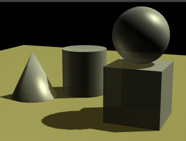
| Fig.03 - Note the variation in value of cast shadows on different surfaces |
 |
| Fig.04 - Note the variation of surface light on the sphere in the shading and cast shadows |
 |
| Fig.05 - Although appearing randomly composed, this image's value lies in the form definition revealed in shaded and reflected surfaces |
In the beginning of this project, I assumed that the strongest methodology for modeling three dimensions would focus on a definitive light source using highlights and cast shadows to create contrast. With a background in drawing and design visualization I was surprised by the reduced evidence of edge highlights and surface definition in directly illuminated surfaces. Instead, a much richer variety of light modulation appears to exist in the shading and cast shadows where ambient and reflected light from adjacent surfaces provide softer but distinctive definition.
One of the unintended gains from the photo session has been the revelations in reflected light from one object or surface to another using matte surfaces only. Often in the design process, designers may specify highly reflective surfaces for the product. The downsides to this methodology can be the masking of the true effects of light and the image complexity resulting from bounced reflections.
Lighting Geometric Solids - Refining 3d to coincide with studio lighting
The next step in defining the appropriate lighting configuration is to use the studio lighting image as a benchmark for adding to or adjusting the Maya lighting system.
The first image is the studio photograph followed by sequential changes to the 3d file.
The first image is the studio photograph followed by sequential changes to the 3d file.
 |
| Fig. 01 - Studio photo shoot |
 |
Fig. 02 - Incorrect reflected lighting on the underside of the sphere. |
 |
| Fig.03 - Boost the diffuse setting for better light rendition of surfaces and reorient light fill/reflect into underside of the sphere |
 |
Fig.04 - remove bounce light around outer receding surfaces |
| Fig.05 - Reduce the transparency of the surfaces to reflect more light |
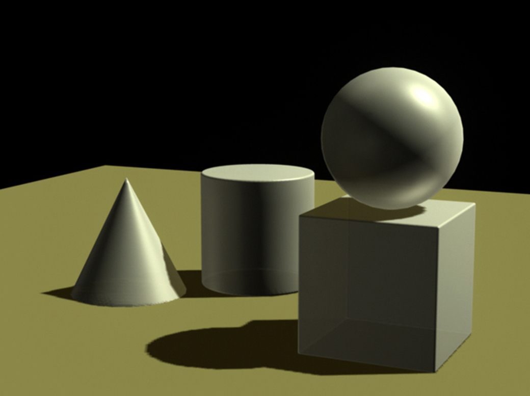 |
Fig.06 - Add rim light on left side of sphere to show reflections of cone and cylinder |
 |
| Fig.07 - Add light from cone reflecting into left side of cylinder |
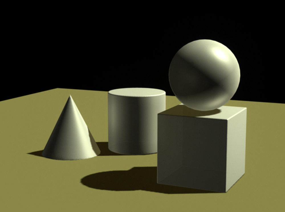 |
Fig.08 - Add light directly from the right to illuminate the cylinder, cone, and cube closer to the studio photograph |
 |
| Fig.09 - Increase resolution of cast shadows |
Sunday, August 14, 2011
Lighting geometric solids - coordinating 3d renderings with reality
The 3d renderings done in Maya prior to this were executed with a general knowledge of lighting from an industrial design education and practice perspective: establish a primary light source ("key light") in a position that illuminates important features of the object/product, casts shadows which help to define features and create a sense of visual depth, and provides secondary lighting to surfaces in shadows with reflected light.
Some assumptions can be made about secondary lighting: with the product resting on or near a ground plane, some light from the overhead primary source will reflect off that plane and up to surfaces in view; ambient light will help to illuminate surfaces in shade cast by the primary light; light from the far horizon is generally portrayed as indirect and cool in nature, illuminating receding surfaces and adding a cool hue to the color which, in turn, adds to visual depth. The earlier Roland Stickney rendering of a John Deere tractor illustrates these principles.
Translating these principles to a Maya image required a reasonable understanding of the software. The results were exhibited in the last posting:
 |
| Fig.01 |
Figure 01 shows geometric solids composed to take advantage of highlights and cast shadows to create a better sense of visual depth and object surface definition. The modeling, however, is still crude because the facets of the polygonal surfaces don't accurately portray real life. Revisions of these features helped to make the highlighted portion of the cone, for example, more realistic as shown in Figure 02 and 03. Addition of edge radii to the cube and cylinder integrated highlights enhancing the 3-dimensional aspects.
 |
| Fig.02 - before and after solids surface refinements |
 |
| Fig.03 - refinements to rendered surfaces and definition Figure 03 sets the stage for the next, essential step in the process of establishing benchmarks for the designer to understand and execute visualizations of illuminated products: photograph the same geometric solids in a studio setting to establish visual benchmarks to verify the logic and mechanics of a drawing system. |
Figure 04 is an image of the geometric solids composition photographed in a studio setting with one primary/key light but no ambient, rim, fill or reflected secondary lights.
 |
| Fig. 04 - studio lighting composition |
While the positioning of the objects and key light are close to the same as in the Maya composition the effects of the lighting are noticeably different. Regardless of the different color value of the computer versus real solids, the light reflected of the #2 surfaces (vertical surfaces facing the direction of the light) is significantly more. Light reflecting of the top plane of the cube into the underside of the sphere is significant. Ambient reflected light from the cone and cylinder into the left side of the sphere is less than indicated in Maya. The highlighted surface of the cone reflects considerable light into the left, shaded surface of the cylinder. Cast shadows vary widely depending on objects and respective illuminated or shaded surfaces in the background.
Refining the Maya light configurations will be the next step to more accurately represent the connection between studio lighting and the computer model.
Refining the Maya light configurations will be the next step to more accurately represent the connection between studio lighting and the computer model.
Monday, August 1, 2011
Maya - traditional lighting system for industrial design concept drawings - Step 01
A first stage to developing an integrating lighting system for industrial designers to use in both drawing and computer visualization would be to take advantage of the depth and breadth of knowledge in the profession of cinematography. As indicated in the last post, the number and range of capability of the different kinds of lights and light functions in theatre and film scenarios far exceed those necessary for the average industrial designer. Many designers are able to work with graphically-literate clients who don't require full-value and -color renderings to understand the concept. As a result, line drawings (or the proverbial napkin sketch) often suffice. Adding the complexity and time requirements of an accurate lighting system with shading and cast shadows in a concept drawing may not be worth the effort.
The equity in a system of the latter, however, is that the designer can never predict the client's reaction to an image, especially one rendered very convincingly by hand. The 'excitement' factor in a near-photographic drawing should never be underestimated. The magic of creating a realistic image by hand has never lost it's value in culture or commerce.
My hypothesis is that the principles of successful cinematographic product lighting with a single key light in Maya could help the ID visualizer understand and implement a powerful, if simple, lighting system on paper to accurately portray form and details of the specific concept. As Maria Palazzi, director of ACCAD, put it so succinctly, "Model with light."
The most recent steps in lighting the simple plane of geometric objects are now concerned, first, with a good composition and, second, with object-individualized key, fill, and bounce lights to create not just an interesting image but one that looks 'obvious' compared to a still life set-up with traditional theatre lighting. The objective is to avoid the hyper-realistic possiblities of too many lights, high levels of surface specularity, and unrealistic conditions and, instead, make an image we can relate to and establish a functional system analogy to help designers integrate the intricacies of successful lighting in their drawings.
Figure 01 shows a recent compostion with, now, several fill lights to bring reflected light into the shaded object features and cast shadows. Unless there is no light present, all surfaces and details will have some level of illumination and reflection.
 |
| Figure 01 Figure 02 shows a close-up of the image with the influence from the fill-lights. Surfaces formerly unseen in shadow are now more visible. Three-dimensional form is better contoured and represented. |
 |
| Figure 02 |
Monday, July 25, 2011
Lighting Issues 02
The last post examined some of the different kinds of light and light sources use in cinematography and design rendering. The former uses many specific lights (key, fill, kicker, bounce, ambient, spot, direct, etc.) while the latter may incorporate only a few of these in a drawing. For many designers, understanding how light illuminates form, surfaces and details represents a lifelong education. Unless you are creating a design that looks exactly like a geometric object (cube, cone, cylinder or sphere, solids traditionally studied in school from a light perspective), you may not have a good precedent for how light interacts with the surface, creating shade, cast shadows and highlights. Even the best visualizers must use some sort of existing example to predict, on paper, what a solid object will look like with light shone on it.
A good method to initiate this process is to find or supply a single light source (sunlight or a flashlight) and place representative solids in position to exhibit the same conditions represented in the drawing (Fig.01.)
An alternative, more easily done now than before, is to model the shape in a computer program (Maya) and configure relative light conditions.
In Industrial Design a concept sketch uses a cast shadow to help define the form of the product by integrating a dark background that, in contrasting with the lighter tones of the focal point, helps to generate the impression of three-dimensionality and reality that a line drawing or simple shading cannot (Fig.02.)
Additionally, there are added benefits to establishing a light system for the concept drawings. Incorporating a hierarchy of light and colored light sources helps to define visual depth. Syd Mead, a long-time designer, 'futurist' (as he refers to himself), and visualizer is a master of integrating warm and cool light sources to create a sense of great depth beyond the picture plane (Fig.03.)
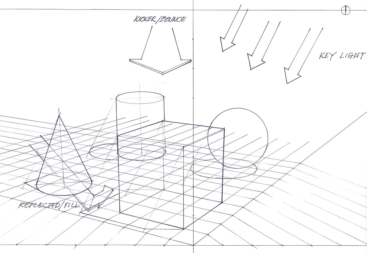
There are three components: first, a key light used for primary imaging, often associated with parallel light rays ('infinite' light in cinematographic terms); second, ambient or reflected lighting that adds depth and complexity to the reflected light in the shadows - often a warm ground tone; third, reflected light from the distant horizon or sky - often a cool, bluish tone - seen on the rear trailing surfaces of the product. This latter may be termed a kicker or bounce light. Even though the concept sketch may be of an interior product, using warm and cool contrasting tones helps with the shadow to create the 3D characteristic. See Figure 01 for directions the lights may originate from.
Unfortunately, there is no formula for calculating or adjusting the intensity, color and configuration of each of the light sources indicated here. The rendering's effectiveness is generally a result of direct observation from life and techniques of other designers as well as some level of instruction. As can often be the case, each designer will choose a preferred method of visualization and adapt it to his/her process.
In Maya and computer rendering, however, the ability to control, adjust, manipulate, and configure these variables is so powerful, any one task may not ever approach the software's capacity. Accordingly, one must learn each well enough to understand the repercussions of settings intended or not as exhibited in my first crude examples.
The mental models used to light a product are also different between drawing and computer rendering. Fill lighting, for example, cannot be assumed to reflect off a ground plane and upward into the underside of an object; it may be projected from a viewpoint within inches of the object even if the final effect resembles a lightsource far away in real life. Figure 03 shows the positions of the key, fill, and bounce lights. The light positions, accordingly, must be adjusted if the perspective view is changed to make sure the viewed surfaces are reflecting light and are properly illuminated for the observer.
A good method to initiate this process is to find or supply a single light source (sunlight or a flashlight) and place representative solids in position to exhibit the same conditions represented in the drawing (Fig.01.)
 |
| Fig01 - A simple object in natural sunlight to understand shading/cast shadows. |
An alternative, more easily done now than before, is to model the shape in a computer program (Maya) and configure relative light conditions.
In Industrial Design a concept sketch uses a cast shadow to help define the form of the product by integrating a dark background that, in contrasting with the lighter tones of the focal point, helps to generate the impression of three-dimensionality and reality that a line drawing or simple shading cannot (Fig.02.)
 |
| Fig. 02 - Outdoor grill concept sketch |
Additionally, there are added benefits to establishing a light system for the concept drawings. Incorporating a hierarchy of light and colored light sources helps to define visual depth. Syd Mead, a long-time designer, 'futurist' (as he refers to himself), and visualizer is a master of integrating warm and cool light sources to create a sense of great depth beyond the picture plane (Fig.03.)
 |
| Fig.03_ Syd Mead |
There are three components: first, a key light used for primary imaging, often associated with parallel light rays ('infinite' light in cinematographic terms); second, ambient or reflected lighting that adds depth and complexity to the reflected light in the shadows - often a warm ground tone; third, reflected light from the distant horizon or sky - often a cool, bluish tone - seen on the rear trailing surfaces of the product. This latter may be termed a kicker or bounce light. Even though the concept sketch may be of an interior product, using warm and cool contrasting tones helps with the shadow to create the 3D characteristic. See Figure 01 for directions the lights may originate from.
 |
| Figure01 - General ID product sketch lighting scenarios A good example of this kind of image is shown in Figure 02 of a gouache rendering of a John Deere tractor in 1940 for Henry Dreyfuss Associates. A strong cast shadow with warm fill tones in front and underneath and cooler sky tones reflected on top and trailing surfaces offer a near-photographic if muted quality of visualization. |
 |
| Fig.02 - Flinchum, R. (1997), Henry Dreyfuss, Industrial Designer - The Man In The Brown Suit. New York, NY: Rizzoli International Publications. p.120 |
Unfortunately, there is no formula for calculating or adjusting the intensity, color and configuration of each of the light sources indicated here. The rendering's effectiveness is generally a result of direct observation from life and techniques of other designers as well as some level of instruction. As can often be the case, each designer will choose a preferred method of visualization and adapt it to his/her process.
In Maya and computer rendering, however, the ability to control, adjust, manipulate, and configure these variables is so powerful, any one task may not ever approach the software's capacity. Accordingly, one must learn each well enough to understand the repercussions of settings intended or not as exhibited in my first crude examples.
The mental models used to light a product are also different between drawing and computer rendering. Fill lighting, for example, cannot be assumed to reflect off a ground plane and upward into the underside of an object; it may be projected from a viewpoint within inches of the object even if the final effect resembles a lightsource far away in real life. Figure 03 shows the positions of the key, fill, and bounce lights. The light positions, accordingly, must be adjusted if the perspective view is changed to make sure the viewed surfaces are reflecting light and are properly illuminated for the observer.
 |
| Fig.03 - Maya image of solids with key, bounce and fill light positions and effects As indicated in the previous post, composition of the physical elements should be considered not just for maximum views of surfaces and details but also to use highlights and cast shadows of one solid or area as backgrounds to another subject to help create a visual perception of depth. Cinematographers use spot and rim lights to isolate and frame subjects in the process of creating a visual hierarchy so the viewer is never confused about what he/she should focus their attention on. The next post will begin to examine the process of casting shadows in drawing and in 3D rendering. |
Monday, July 18, 2011
Rendering - Lighting Issues01
Lighting a scene is often one of those elements of a visual production that goes unnoticed or is taken for granted - until it's done poorly.
Whether the presentation is theatre, TV, film, computer animation, drawing, painting, or design visualization, adding visual depth using light and shadow produces a powerful effect. Not only may the image literally represent another reality but the image maker can orchestrate the scene to specifically direct our attention. The observer has an easier time understanding an image created with the use of light than one rendered flat or purely graphic in nature. Many people in the design or entertainment industry are visually literate enough to see important value in the 'napkin sketch' that offers ideas drawn without shading, color or value. Designers, however, need to show an understanding of how light works to cater to the largest possible audience for their ideas.
The science of lighting is an integral part of the design of a visual in cinematography but curiously absent from the curriculum of industrial design.
Design concepts may be rendered with one light source but most effectively use three: key, fill, and kicker or rim lights. In Figures 01, 02, 03, and 04 from Pixel Cinematography - A Lighting Approach for Computer Graphics by John Kahrs, the author first shows the overall effect of 'standard' studio lighting and then visually separates each.
The most important discovery of this process for me was a closer understanding of the differences in approach to lighting the two endeavors use. Industrial designers usually consider one light source and a simplified cast shadow color of black. Knowledge of lighting science is not critical since design drawings may be successful in a graphic instead of realistic nature. Industrial designers using 3D modeling programs generally do not have the background in cinematographic lighting conventions briefly explained above and learn 'on the job'. Computer modelers and animators, however, are required by the medium to learn these skills to keep pace with the audiences demand for realism. The differences between key, fill, kicker, ambient, spot, point, area, and infinite lights are specific and purpose-driven. The nature of light illuminating a surface is a powerful tool in describing form for any design medium.
The other discovery is how one must analyze the effects sought in a computer rendering setting before choosing the light specific to that requirement. For example, a bounce or fill light is best obtained steering a direct/key light through the underside of a plane to the underside of the object and adjusting the surface character variables (diffuse/reflective, specularity, transluscency, color, etc.) to effect the desired aesthetic. This procedure will be discussed further in the next post.
References
Whether the presentation is theatre, TV, film, computer animation, drawing, painting, or design visualization, adding visual depth using light and shadow produces a powerful effect. Not only may the image literally represent another reality but the image maker can orchestrate the scene to specifically direct our attention. The observer has an easier time understanding an image created with the use of light than one rendered flat or purely graphic in nature. Many people in the design or entertainment industry are visually literate enough to see important value in the 'napkin sketch' that offers ideas drawn without shading, color or value. Designers, however, need to show an understanding of how light works to cater to the largest possible audience for their ideas.
The science of lighting is an integral part of the design of a visual in cinematography but curiously absent from the curriculum of industrial design.
Design concepts may be rendered with one light source but most effectively use three: key, fill, and kicker or rim lights. In Figures 01, 02, 03, and 04 from Pixel Cinematography - A Lighting Approach for Computer Graphics by John Kahrs, the author first shows the overall effect of 'standard' studio lighting and then visually separates each.
 |
| Fig.01 - Kahrs, J. (1996), p.45 - Studio lighting with key, fill, and kicker lights |
 |
| Fig.02 - Kahrs, J. (1996), p.47 - Key light |
 |
| Fig.03 - Kahrs, J. (1996), p.48 - Fill light |
 |
| Fig.04 - Kahrs, J. (1996), p.49 - Kicker or Rim light |
In industrial design, a product is generally illuminated from the side with a primary light source, sometimes referred to as an "infinite" light source, similar to the sun: the rays are parallel when casting shadows. The position angle of the light source should be carefully chosen. Too high and there's not enough cast shadow; too low and the cast shadow (dark, contrast) dominates the scene. To show a maximum level of detail and form, scene lighting works best if there is good contrast between the object and the background. To generate many concepts quickly, it often works best to have the background and ground plane as white and the product dark or with color so that the viewer's eye is drawn immediately to the main image. In Figure 05, the contrast of the object makes it the main focal point with a light background. The cast shadow establishes the ground plane. Fill light is seen in the lighter areas of sides 2, 3 representing reflected light from the key light striking the ground. Secondary lighting, shown as the reflected lighter area on the back top surface of the cube, represents the "kicker" lighting.
 |
| Fig.05 - Industrial design concept visualization with light Often in different types of imagery, the artist will add color to the lights/ light sources. Comic illustrators may use a combination of warm and cool colors in lighting from two sides (primary/secondary or key/kicker). Using colors in this way will increase the visual effect of depth and realism to the image (see Figure 06.) |
 | ||
| Fig.06 - Kerlow, I. (2004), p.202 Last week I began to explore some of these lighting issues in Maya with the geometric objects set on a plane. With only marginal knowledge of the lighting systems available in the software, I set a primary light as shown previously and then an Ambient light thinking it might work as a fill/kicker light source. Working with the two variables of light Intensity and Ambient Shade I was able to insert secondary fill/reflected lighting with different colors, one cool and one war(Figure07,08.)
|

 |
| Fig.08 - Ochre/ground tone reflected ambient light It wasn't until Zach Maynard, one of the resident experts in computer visualization at ACCAD, happened to give me a primer on the different lighting options available that could best accomplish what I was trying to visualize. He set up the same scene with a new camera angle, the key light and a bounce/fill light that would show reflected light in the dark areas of the shading and cast shadows (Figure 09.) |
 |
| Fig.09 - Zach M. layout with reflected fill light |
The most important discovery of this process for me was a closer understanding of the differences in approach to lighting the two endeavors use. Industrial designers usually consider one light source and a simplified cast shadow color of black. Knowledge of lighting science is not critical since design drawings may be successful in a graphic instead of realistic nature. Industrial designers using 3D modeling programs generally do not have the background in cinematographic lighting conventions briefly explained above and learn 'on the job'. Computer modelers and animators, however, are required by the medium to learn these skills to keep pace with the audiences demand for realism. The differences between key, fill, kicker, ambient, spot, point, area, and infinite lights are specific and purpose-driven. The nature of light illuminating a surface is a powerful tool in describing form for any design medium.
The other discovery is how one must analyze the effects sought in a computer rendering setting before choosing the light specific to that requirement. For example, a bounce or fill light is best obtained steering a direct/key light through the underside of a plane to the underside of the object and adjusting the surface character variables (diffuse/reflective, specularity, transluscency, color, etc.) to effect the desired aesthetic. This procedure will be discussed further in the next post.
References
Calahan, Sharon (1996), Storytelling Through Lighting - A Computer Graphics Perspective. Siggraph '96 Course #30.
Kahrs, John (1996), Pixel Cinematography - Lighting for Computer Graphics. Siggraph '96 Course #30.
Kerlow, Isaac V. (2004), The Art of 3D Computer Animation and Effects. Hoboken, NJ: John Wiley & Sons.
Thursday, July 7, 2011
Issues of Perspective
Constructing solids in perspective is an exercise in judgement. Although I discussed Doblin's system of two-point perspective with its measuring points and the ability to lay out an indexed grid, the system represents an approximation of reality.
The first issue to cover is the nature of drawing in perspective which, in many ways, is the most complicated aspect to understand. In reality, perspective seems obvious and without distortion because we observe space in three dimensions (horizontal, vertical, and depth or, in mathematical terms, the x, y, and z axes). Translating this phenomenon to two dimensions requires a graphic understanding of the shape of objects in space and the related visual changes as space recedes in distance.
The Picture Plane is the surface of a plane on which all 3-dimensional objects we view beyond are represented 2-dimensionally. The Picture Plane is usually represented by the pad of paper (or computer screen) on which we depict the objects. See Fig.01 for Doblin's illustration. Please note that his drawn visualization of the observer ( geometrically pear-shaped with a bow-tie and pointed shape for a head), as distracting as it may be, is purely for understanding the context.
The nature of our vision is 3-dimensional, however, so, unless the picture plane is infinitely large to depict all space in our front view to the periphery, we restrict our recorded view to an area known as the Cone-of-Vision. This idea is best represented by the analogy of a camera lens: the camera can only see to a certain angle away from the center of vision.
If one sets up a two-point perspective drawing it becomes apparent that a square grid on the ground plane changes shape depending both on the distance from the viewer and on the proximity to the outer boundaries of the cone-of-vision.
In Figure 02, note the distortion in the shape of a square footprint near and beyond the boundary of the Cone of Vision. According the to the perspective grid, the shape of a square would have angles less than 90 degrees, an impossibility. This phenomenon may often be observed in architectural photography where images are distorted due to the prismatic nature of the wide-angle lenses used on the camera. For industrial design, however, drawings of form would confuse the observer if distortion was included in the visualization. In Fig. 2, squares A1 and B appear to be in proportional perspective. This area could be termed a 'sweet spot' for accurate visualization. Moving away from this area uses perspective grids that become progressively distorted.
In Figure 03, the 'sweet spot' for accurate perspective is near the picture plane and origin, the cube shows the least distortion. Moving away to the left, however, one notices that the ellipses used in the cone and cylinder do not coincide completely with the foot prints of the outline parameter cubes. With all vertical center lines and surfaces kept perpendicular to the ground plane, ellipse guides (true perspective with no distortion) become unreliable and don't fit the square footprints.
Observing the same view in Maya, however, the software has the sophisticated ability to adjust both ellipses and vertical lines to a 3rd vanishing point (Fig.04).
If one introduces a third-point in the drawn perspective the template ellipses work much better (Fig.05) The implications are, however, that a 3-point perspective system must be used to depict larger visualizations to avoid distortion.
Interestingly, one can document the mathematical precision of the Maya visualization software by observing the change in perspective comparing an ellipse on the screen and an ellipse from a template. As any particular point in space recedes into the distance, the angle of view changes incrementally. Ellipse templates only give an approximation every 5 degrees and are symmetrical front to back. Maya, conversely, is able to accurately predict the exact elliptical angle at any point in space - thus, the deviation shown from matching the front half of a template to the screen image to the back half in Figure 06.
As capable as Maya is at depicting many variations of perspective there lie hidden traps for the less-than-expert user. If one selects the Camera icon from the sub-menu, a host of variables are offered for adjustment: Angle of View, Focal Length, Camera Aperture, Film Aspect Ratio, and Camera Scale are among several that may be fine-tuned. Note the differences between the perspective views of Figures 07 and 08 which result mostly from changes in just the aperture.
As shown in figures 07 and 08, the impact of a single image can change dramatically with just a few adjustments to the software viewing set-up. This represents a risk for the designer who may not fully understand the implications of the power of modeling/rendering software.
Although dramatic, the implications of forced perspective shown in figure 08 can be illustrated another way. Doblin explains that the angle of a horizontal square intersection visualized in a 2-dimensional plane can never be 90 degrees because it would require the viewer to be looking down from directly above plane or object. See figure 09. In design, one has to balance inspiring the client and risking confusion from images that don't represent reality.
Constructing solids in perspective is an exercise in judgement. Although I discussed Doblin's system of two-point perspective with its measuring points and the ability to lay out an indexed grid, the system represents an approximation of reality.
The first issue to cover is the nature of drawing in perspective which, in many ways, is the most complicated aspect to understand. In reality, perspective seems obvious and without distortion because we observe space in three dimensions (horizontal, vertical, and depth or, in mathematical terms, the x, y, and z axes). Translating this phenomenon to two dimensions requires a graphic understanding of the shape of objects in space and the related visual changes as space recedes in distance.
 |
| Fig.01 - Doblin, J. (1956), p.8 - A view of the picture plane |
The nature of our vision is 3-dimensional, however, so, unless the picture plane is infinitely large to depict all space in our front view to the periphery, we restrict our recorded view to an area known as the Cone-of-Vision. This idea is best represented by the analogy of a camera lens: the camera can only see to a certain angle away from the center of vision.
If one sets up a two-point perspective drawing it becomes apparent that a square grid on the ground plane changes shape depending both on the distance from the viewer and on the proximity to the outer boundaries of the cone-of-vision.
 |
| Fig.02 - Doblin, J. (1956), p.18 - The 'Cone of Vision' - Note the distortion near to and beyond the boundaries. |
 |
| Fig. 03 - 30-60 two-point perspective. Note the difficulty in matching a template ellipse for the cone base while maintaining a vertical minor axis. |
In Figure 03, the 'sweet spot' for accurate perspective is near the picture plane and origin, the cube shows the least distortion. Moving away to the left, however, one notices that the ellipses used in the cone and cylinder do not coincide completely with the foot prints of the outline parameter cubes. With all vertical center lines and surfaces kept perpendicular to the ground plane, ellipse guides (true perspective with no distortion) become unreliable and don't fit the square footprints.
Observing the same view in Maya, however, the software has the sophisticated ability to adjust both ellipses and vertical lines to a 3rd vanishing point (Fig.04).
 |
| Fig.04 - Screenshot of four solids in Maya. Note the 3rd point perspective for vertical lines. |
If one introduces a third-point in the drawn perspective the template ellipses work much better (Fig.05) The implications are, however, that a 3-point perspective system must be used to depict larger visualizations to avoid distortion.
 |
| Fig. 05 - 3-point perspective shows deviation of vertical lines from y-axis |
Interestingly, one can document the mathematical precision of the Maya visualization software by observing the change in perspective comparing an ellipse on the screen and an ellipse from a template. As any particular point in space recedes into the distance, the angle of view changes incrementally. Ellipse templates only give an approximation every 5 degrees and are symmetrical front to back. Maya, conversely, is able to accurately predict the exact elliptical angle at any point in space - thus, the deviation shown from matching the front half of a template to the screen image to the back half in Figure 06.
 |
| Fig. 06 - Comparison of ellipse template and Maya-generated ellipse. Note the gap at the rear/top of the two ellipse representations. |
As capable as Maya is at depicting many variations of perspective there lie hidden traps for the less-than-expert user. If one selects the Camera icon from the sub-menu, a host of variables are offered for adjustment: Angle of View, Focal Length, Camera Aperture, Film Aspect Ratio, and Camera Scale are among several that may be fine-tuned. Note the differences between the perspective views of Figures 07 and 08 which result mostly from changes in just the aperture.
 |
| Fig. 07 - Super 16mm - note the foreshortening in the foreground. |
 |
| Fig.08 - 70 mm Projection - note the wide-angle distortion in the perspective |
Although dramatic, the implications of forced perspective shown in figure 08 can be illustrated another way. Doblin explains that the angle of a horizontal square intersection visualized in a 2-dimensional plane can never be 90 degrees because it would require the viewer to be looking down from directly above plane or object. See figure 09. In design, one has to balance inspiring the client and risking confusion from images that don't represent reality.
 |
| Figure 09 - Doblin, J. (1956), p. 19. What distorted perspective means to the viewer. |
Wednesday, June 29, 2011
Getting Started - Cognition Issues
In design education, as most disciplines, the challenge is often not the end result but the learning process involved in gaining knowledge considered arcane but essential to developing a system for creativity.
Learning to draw is arguably the single most difficult skill designers must master. Sometimes referred to as the 'language of design', drawing is how designers communicate to the client, to other designers, and to themselves in the process of problem solving, creation, and refinement. To properly visualize a concept, perspective drawing skills are necessary to translate an idea in the mind to a two dimensional image that "looks right".
In 1956, Jay Doblin published a treatise on design perspective systems focusing on product visualization. His two-point 30-60 degree layout shown below in print (Fig.1) and in example (fig.2) may require a large flat surface (e.g., drafting table) to properly complete. Although considered obsolete, this system helps the designer understand the structure of vanishing points and perspective - located off the page for the observer but very much considered by the designer in the visualization process. The advantage of this system is that the designer understands the logic of perspective systems and automatically creates a grid for repeated use.
Doblin's perspective system allows the designer to construct an indexed grid for any unit of measurement to draw an accurate, dimensional, 2D representation of a concept.
Others have developed instructional systems using established perspective grids that may be used as underlays in the drawing process (Fig.3). Dr. Noel Mayo, at the Ohio State University, has used this system successfully not just in professional practice but also in helping students overcome the fear associated with most drawing exercises.
The difficulty of learning perspective drawing is that little of the process is intuitive. Additionally, the designer must acquire the skill to evaluate whether the drawing "looks right" since all perspective systems have some distortion built in as approximations of reality. Professional designers are required to present images that look real - if the perspective is incorrect, the observer or client may misinterpret the concept.
Conversely, learning 3D computer visualization software is neither intuitive nor simple. The digital modeling and rendering systems are both extraordinarily capable and complex at the same time. They offer tools to visualize forms and images in a myriad of variations while preparing electronic files that may be used for tooling in manufacturing. Designers now have control over subtleties of form in production parts that were not available 20 years ago.
Maya, design software offered by Autodesk, represents a gold-standard in visualization capability that extends from industrial design to entertainment design and animation. It is so powerful that many designers know and use only a portion of the total package.
With the capability, however, comes daunting complexity. Visualization tools and controls not only construct surfaces and images using methods and protocol foreign to building methods used in real life, they are governed by new vocabulary and language (Fig.4).
Sets of menu systems, macros, and iconography must be searched, investigated, experimented with, and learned largely by regular use to begin a development system for computer visualization (Fig.5). Multiple menus may perform similar if redundant tasks offering different ways to do the same thing while adding complexity to system understanding.
Currently, scientific literature is more complete documenting the creative cognition associated with drawing versus computer visualization. Future studies may show parity in the two processes.
Drawing and computer processes both require different thinking to translate ideas to 2D images. I'll explore those protocols in more detail next.
Learning to draw is arguably the single most difficult skill designers must master. Sometimes referred to as the 'language of design', drawing is how designers communicate to the client, to other designers, and to themselves in the process of problem solving, creation, and refinement. To properly visualize a concept, perspective drawing skills are necessary to translate an idea in the mind to a two dimensional image that "looks right".
In 1956, Jay Doblin published a treatise on design perspective systems focusing on product visualization. His two-point 30-60 degree layout shown below in print (Fig.1) and in example (fig.2) may require a large flat surface (e.g., drafting table) to properly complete. Although considered obsolete, this system helps the designer understand the structure of vanishing points and perspective - located off the page for the observer but very much considered by the designer in the visualization process. The advantage of this system is that the designer understands the logic of perspective systems and automatically creates a grid for repeated use.
 |
| Fig.1 - Doblin, J., 1956. Perspective - a new system for designers. p.24 |
Doblin's perspective system allows the designer to construct an indexed grid for any unit of measurement to draw an accurate, dimensional, 2D representation of a concept.
 |
| Fig.2 - Cube in perspective. |
Others have developed instructional systems using established perspective grids that may be used as underlays in the drawing process (Fig.3). Dr. Noel Mayo, at the Ohio State University, has used this system successfully not just in professional practice but also in helping students overcome the fear associated with most drawing exercises.
 |
| Fig.3 - Mayo, N. and Feracho, T., 2002. |
The difficulty of learning perspective drawing is that little of the process is intuitive. Additionally, the designer must acquire the skill to evaluate whether the drawing "looks right" since all perspective systems have some distortion built in as approximations of reality. Professional designers are required to present images that look real - if the perspective is incorrect, the observer or client may misinterpret the concept.
Conversely, learning 3D computer visualization software is neither intuitive nor simple. The digital modeling and rendering systems are both extraordinarily capable and complex at the same time. They offer tools to visualize forms and images in a myriad of variations while preparing electronic files that may be used for tooling in manufacturing. Designers now have control over subtleties of form in production parts that were not available 20 years ago.
 |
| Fig.4 - Screen capture of Maya window. |
Maya, design software offered by Autodesk, represents a gold-standard in visualization capability that extends from industrial design to entertainment design and animation. It is so powerful that many designers know and use only a portion of the total package.
With the capability, however, comes daunting complexity. Visualization tools and controls not only construct surfaces and images using methods and protocol foreign to building methods used in real life, they are governed by new vocabulary and language (Fig.4).
 |
| Fig.5 - Close up of Maya window. |
Currently, scientific literature is more complete documenting the creative cognition associated with drawing versus computer visualization. Future studies may show parity in the two processes.
Drawing and computer processes both require different thinking to translate ideas to 2D images. I'll explore those protocols in more detail next.
Subscribe to:
Posts (Atom)